Up close and personal with Chris Grosz
IR illustrator and storyboard artist Chris Grosz has a few tales to tell. Also a graphic designer, painter, cartoonist and past creative director, Chris Grosz’s work has illustrated and parodied people and places since the 1960s. Nicole Stock editor of Urbis magazine discussed his graphic novel, and what he’s learnt over the years. Original interview found in Issue #65. Shot by IR photographer Nic Staveley.
Urbis: How did you get into graphic design?
Chris Grosz: My mother was a sculptress. My father was a furrier in Dunedin, and he was a painter. Consequently, in our house, art was just always around us. But painting wasn’t going to pay the bills, unfortunately, so graphic design was the next best thing. I went into a printing apprenticeship at Whitcombe & Tombs. It was almost Dickensian, it was run by old guys with green eye shades with a hair part in the middle, all in double-breasted suits, puffing on pipes. On reflection, I learnt a lot from these people without even realising it. You know, they taught me how to persevere, they taught hand lettering, no one knows hand lettering these days. It’s almost like going back several centuries, because New Zealand was so far behind the times, but those skills I never forgot. What I call myself now, is ‘Old School New School’. What I use now is scraperboard (which I did Kimble Bent in, seen on page 122), gouache, watercolour, hand lettering, mono prints, lino prints, all of those old techniques, but now I put them in Photoshop and I can tweak them and do things to them. People say to me, “Where did you get the software to do that…’. And in actual fact, all it is, is craft, old-fashioned craft.

U: Do you approach cartooning, illustration or graphic design differently?
CG: No, the creative process is the same. It’s like creating a problem for yourself to solve, it’s just the outcome is different.
U: You do have so many styles to your work. Why’s that?
CG: Well, let’s be totally pragmatic: it keeps me employed. That’s just my nature, I get bored easily, most creative people do. So stylistically it’s the same thing, I like to jump around. Quite often I’ll tell the client, “Don’t give me the problem already solved. As an illustrator, don’t ask me to draw a picture of Santa Claus. I know people who could do you a great Santa Claus, but if you wanted me to come up with a visual idea with some Christmas feel, then, to me, that’s much more challenging.” I do visual sampling. I take an influence from here and there, or if I’m parodying something, like an old master’s painting, or someone, I do it with genuine affection; I’m not just ripping them off.
U: What can a drawing or an image show that a written piece of text can’t?
CG: What I try to do is enhance the text. I don’t do a literal translation. Because what’s the point? What you should do is work hand in hand with the words, enhance or reinforce them, or illuminate them in some way.

U: Going back to some of your earlier graphic design work, how did you get into doing rock and roll posters?
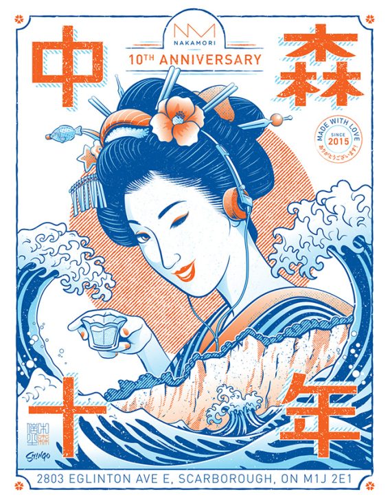
CG: Purely by accident. I was working for TV2 as a title designer, and one of my staff cracked this incredible job, a Frank Zappa poster. I don’t know how he got it but he did. And it was too big for him, he was all over the place, and he said, “What am I going to do,” and I said, “Well, I could give you a hand.” Anyway, I did this poster of Frank Zappa, and when it went to Australia, everyone thought it had been done in America, but in actual fact it had been done in conservative old Christchurch. That was my first opportunity, my first international poster. And I also met this guy called Mike Seeger who was out here for some folk festival, and he saw my drawings in a folk magazine, and he took them back to America and they appeared in Sing Out magazine. So when I eventually went to Australia, I already had a bit of a pedigree. Later I went to Melbourne, and somone suggested that I go to these rock entrepreneurs to see if I could get a job. These people had tours all the time, so I ended up working for Australian Club Entertainment producing two posters a week. They paid me nothing, but it was great. And I got to meet Elvis Costello and the Stranglers and Tom Waits and Ry Cooder, all these incredible people.
U: What was great about doing these posters?
CG: Rock and roll was the last area to be corporatised, and it has been recently, I’ve noticed. I’ve done a few jobs for record companies and they all have fixed ideas: “Oh, you can’t do that, you can’t do that.” But rock and roll’s never been like that, rock and roll is the one area where you could say this is what I’m doing, and if you don’t bloody like it, get someone else. Consequently, you could take creative risks.
U: More recently you’ve taken to writing and illustrating a graphic novel, Kimble Bent, Malcontent.
CG: I went to Taranaki with my sister, and I met this guy who had this museum with a tableau of Kimble Bent and I thought, “That’s the story, that’s the one I’ve been looking for.” And he said, “Oh, I can show you where this battle was.” So I went to the sites of all these battles with a pad and pen. And I started to draw the landscapes. Then I came back to Auckland and I started to paint them, and then I put the people on top of the landscapes.

U: Graphic novels are getting more recognition, but they can fit a little awkwardly between novels and cartoons.
CG: Yes, I’ve found that too. People wonder, is it serious, or is it a cartoon? The name, ‘novel’ gives it gravitas, and ‘graphic’ gives it some sort of decoration. I mean it’s not really a novel in the technical sense, in that there’s not a hell of a lot of romance in it. I think it is probably a graphic historical narrative. Also, when I lived in Hong Kong all my staff read manga comics. Every morning they’d be lying on the floor reading manga comics, and so I started to read them, and thought, “This is really engaging. If I could use this as a vehicle to educate, I’d be on to something.”
“You have this power with your pen to be as visceral or acidic as you like or as soft and nice as you like”.
U: It must be a difficult line you have to walk as a caricaturist. How do you walk that line between meanness and humour?
CG: Because humour is so subjective you have to appeal to a wide audience. You have to go from what I call fatty and skinny jokes – laughing at other people’s misfortunes – to, abstract metaphor. You have to run the whole gamut, or else you don’t have a job. I don’t like cartoons that are lazy. They can’t get a likeness, so they’ll write their name on their briefcase or on their forehead. That’s absolute laziness. I think it’s imperative to get a likeness first because then, half the story is told. You don’t need to have arrows and too many words explaining things. Now, you can distort that as far as you like. You can distort things to make a political point or you can almost go the sweet, nice version of things, like Hello Kitty. But that’s the great thing – you have this power with your pen to be as visceral or acidic as you like, or as soft and nice as you like. I think that’s a discipline. It’s like you know when to put your foot on the accelerator and when to take it off. Otherwise, you could just tear into everything. I’m not an iconoclast in that sense, but also I won’t suffer fools easily. See, all of my work has an idea in it. If it doesn’t have an idea in it, it’s decoration. That’s how I look at it. If it doesn’t have some substance to it, then it’s just a nice drawing.
U: How has graphic design changed over your career? Computers would have been a huge shift…
CG: Yeah, but computers are just an outcome. Because the computer, to me, is like a paint box or a box of pencils, it’s just another tool. The thing that has changed in graphic design really, is that I think in the generation before me, retro wasn’t really a thing that happened. But in my lifetime I’ve ended up parodying my own style, with 20 years’ difference. People ask me to do Yellow Submarine style, which I used to do in the sixties, you know, pop art stuff. I don’t think that’s happened before.


